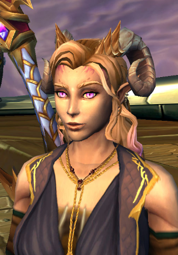
This is one of my dracthyr Evokers, Alecto on Grizzly Hills. This image was sized exactly 350x500px.
It's time to see if this text box lengthens correctly when more text is added to it; ideally it'll go up 4/5ths of the way and then stop. I could make it go all the way now that I figured out how to make it click-through actually, but it's 2am and we're going to have another day of not eating dinner til 5am at this rate lmao, whoops. Gonna do it anyway :B
Also, you said you wanted mouseover text, but I've been doing a lot of stuff with trying to copy text from WoW tooltips lately and that shit's annoying af so I went with something that'd stay open on click lol.
This is another one of my dracthyr, Soranos. I think he's one of only two remaining male characters I have now rofl
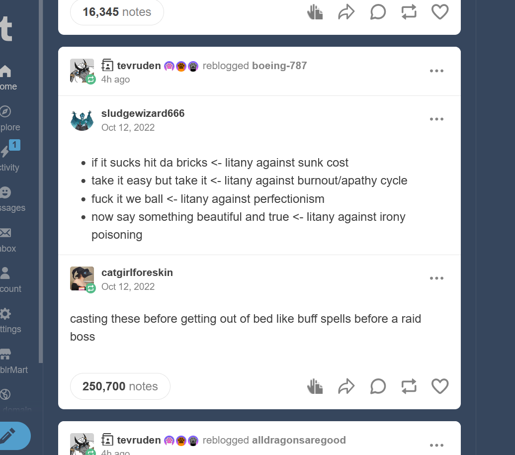
This picture is approximately square in its original dimensions, but will be automatically resized and trimmed to fit in the grid (currently arbitrarily at 350px wide and 500px tall).
A winner is me!
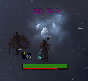
This image is significantly wider than it is tall; I honestly don't know whether you'd prefer hamburger or hotdog images, or exact squares. It's pretty easy to change, though.
This image is some amount smaller than 350x500px and has to be scaled up in order to fit the template appropriately. It can be done, but obviously scaling down tends to work better :P
Anyway, it seemed like a good idea to make it so you didn't have to edit your screenshots to be specific dimensions in order for everything to look nice and neat, because while it doesn't take much time once or twice, it adds up fast and is also annoying. This box also uses a proper paragraph break, I like it better to be honest, heh.
I ran out of screenshots in my wow screenshot folder so have this screenshot of what I was working on before I zoomed off on this project instead :B The lack of elbow rotation in Clip Studio's 3d models makes me very sad.
I very rarely use colours by name (I'm about that hex life if I can get it) but it's interesting to me how Firefox and Chrome display mediumaquamarine slightly differently. Or maybe that's just the window shadow and I'm very tired. Possibly both!
I just realized I've been saving all these screenshots as pngs, but jpgs and stuff should work just as well. Actually....
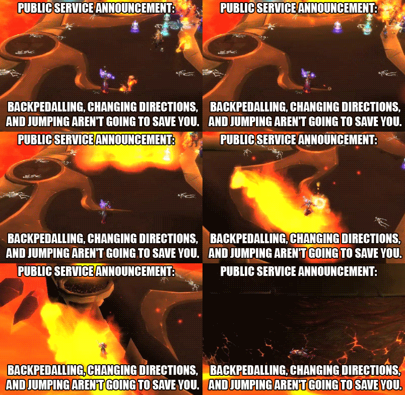
Ahhh, heroic Firelands. Back when I played a shaman and also recorded our attempts/kills, lol.


